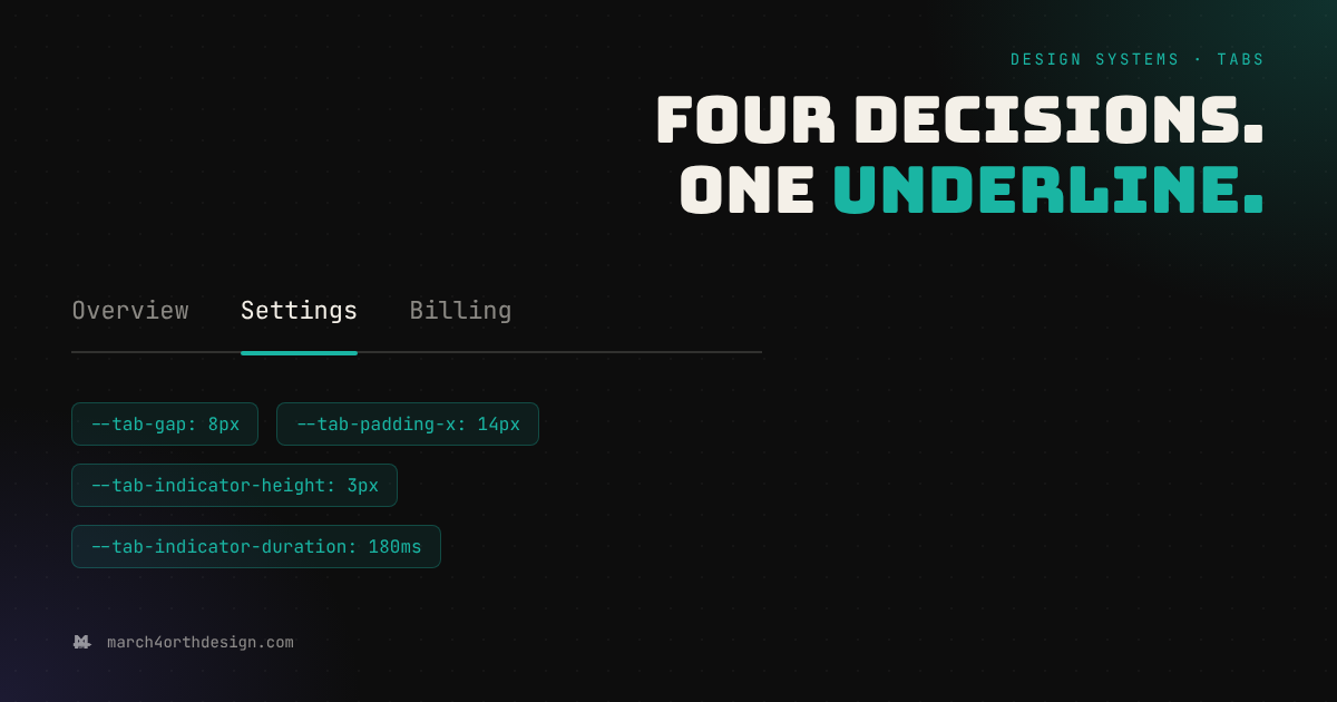

Every tab bar in your product slides to a slightly different beat because nobody named the four decisions that actually control it.
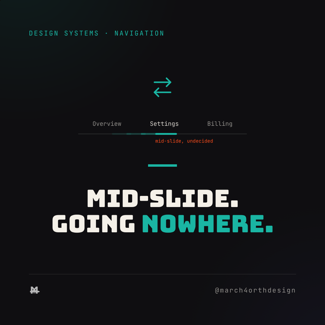
A settings page, a dashboard, an email client: three different surfaces, and in most codebases, three different opinions about how far apart the tab labels sit, how much padding wraps each one, how tall the active-tab underline is, and how long it takes to slide into place. Nobody chose any of that on purpose. The first tab bar someone built used whatever gap felt right in Figma, the second copied a padding value from a component library, and the third got built from scratch because the first two didn't line up and nobody wanted to untangle why.

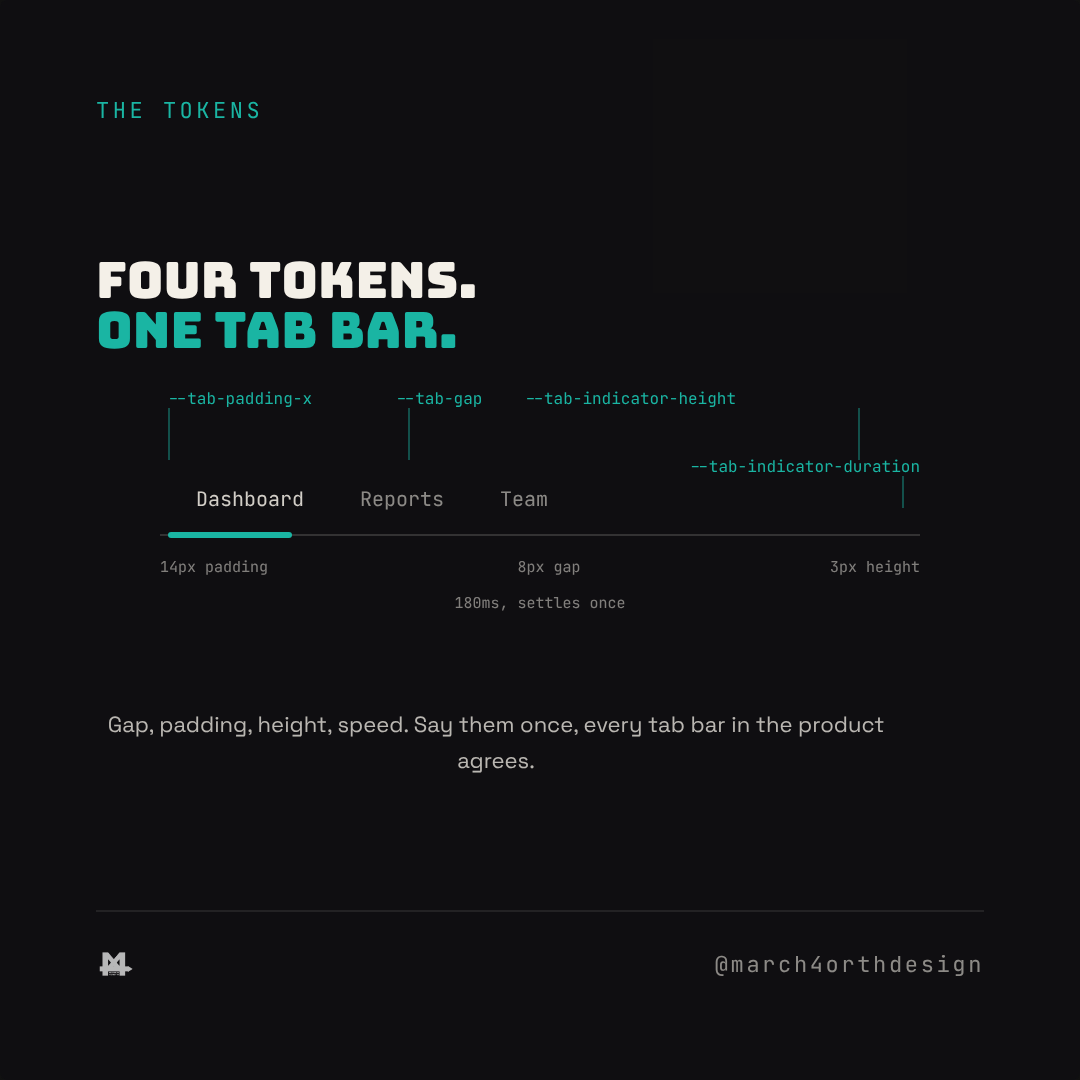
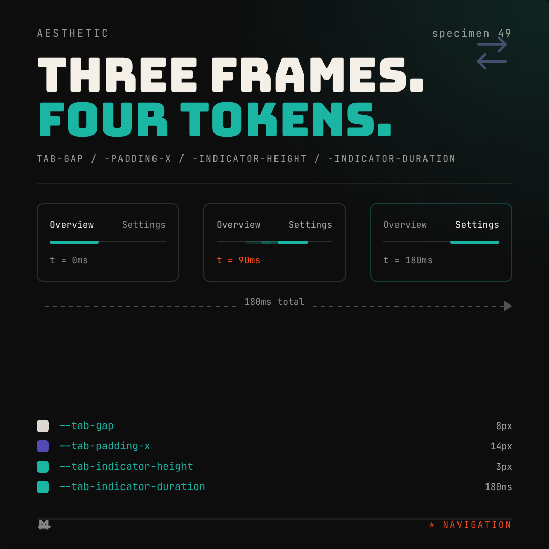
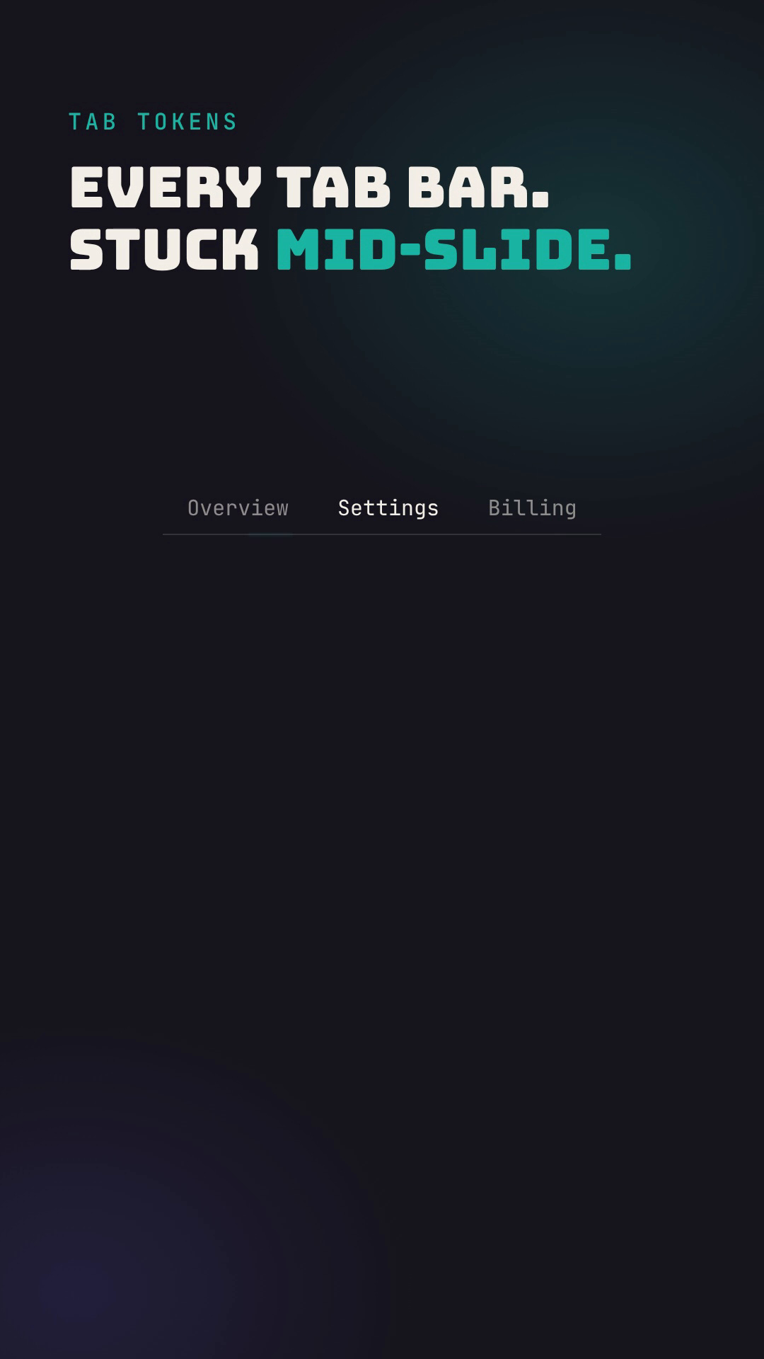
Four tokens fix this the way every other recipe in a design system fixes drift: by naming the decision once instead of re-guessing it per component. `--tab-gap` sets the space between labels so three tabs don't feel cramped while five feel scattered. `--tab-padding-x` sets exactly how much room wraps each label, so a short word like "Team" doesn't get a tap target half the size of "Dashboard." `--tab-indicator-height` sets how thick the active-tab underline reads, instead of every engineer eyeballing a pixel value. `--tab-indicator-duration` sets how long the slide takes, so a two-tab settings page and a five-tab inbox move at the same pace instead of one feeling instant and the other sluggish.
The part that's easy to miss: a tab bar isn't one component, it's a pattern that gets rebuilt every time a new section needs its own navigation. Without shared tokens, each rebuild inherits whatever the last person typed, which is why one tab bar on a page can feel snappy while another two screens over feels like it's still deciding where to land. With the tokens in place, a two-tab settings panel and a five-tab inbox can hold completely different content at completely different widths while still sliding, locking, and settling with the exact same rhythm.
Watch the reel on Instagram. Link going live 2026-12-17 (Thu).
Applying it is mechanical once the four values exist: swap every hardcoded gap, every guessed padding, every ad-hoc underline height, and every mismatched transition-duration inside your tab component for the token. Audit any place a tab pattern got built as a one-off instead of using the shared component, since those are the ones most likely carrying an orphaned value. What changes is subtle but real: a user clicking between five different tab bars across your product stops noticing five slightly different slides and starts trusting one consistent motion, which is exactly the point of naming the decision in the first place.
Follow @march4orthdesign on Instagram for the next one.
Leave a Reply
You must be logged in to post a comment.