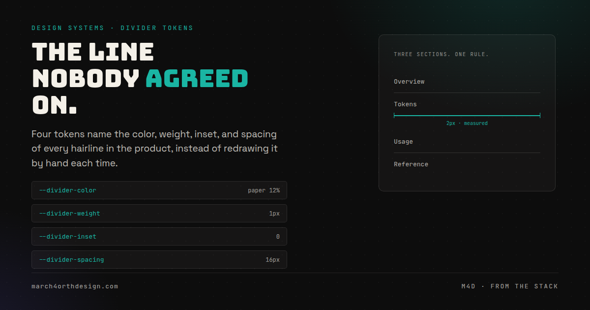

Every hairline separating two sections of your product already has a color, a weight, an inset, and a spacing value, whether anyone decided them on purpose or not.
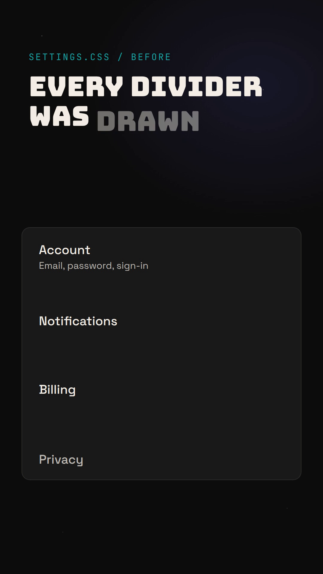
Dividers get built the way toast notifications and avatar stacks do: fast, by whoever needed one first, with no system behind the choice. One section uses a full-bleed line at one pixel. Another insets it thirty-four pixels from each edge, because it looked tidier next to that one card. A third thickens it to three pixels and calls it a "rule" instead of a divider, with no agreement on when a line gets to be thicker than its neighbors. None of this is a bug in any single component. It is the absence of a decision that was supposed to be made once, at the system level, instead of redrawn by hand every time a designer needed to separate two things.

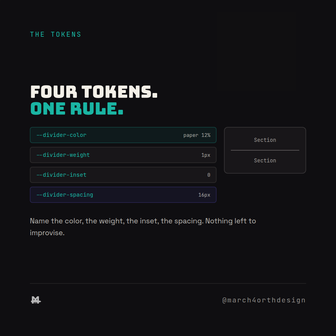
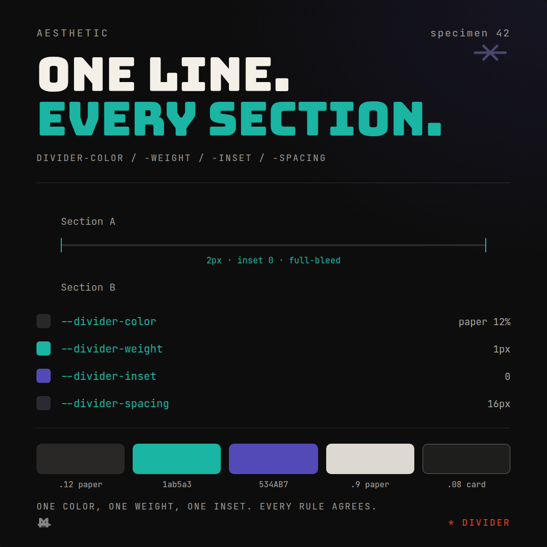
Four custom properties name the decision instead of leaving it to whoever ships next. `--divider-color` is the one value every hairline pulls from, so a sidebar's section break and a settings page's row separator read as the same material instead of two different ideas about what a line should look like. `--divider-weight` fixes how thick a line gets to be, so "rule" and "divider" stop being two different components with two different pixel values nobody can explain. `--divider-inset` and `--divider-spacing` name the two decisions that actually do the most visual work and get skipped the most: how far a line pulls back from its container's edges, and how much air sits above and below it. Neither of those is a color in the usual sense, which is exactly why they get improvised instead of named, right up until a page has twelve sections and every single divider breathes differently.
Watch the reel on Instagram. Link going live 2026-11-14 (Sat).
Applying the recipe is four variables read by one divider component, not a `border-bottom` value copied and tweaked across a codebase. Every place content gets split into sections, a card list, a settings page, a table row, points at the same color, weight, inset, and spacing, so the difference between surfaces is the content, never the geometry of the line between them. A design system that only tokenizes what shows up in a style guide, color, type, spacing, misses the connective tissue: the thousand small lines that hold a layout's hierarchy together and are easy to dismiss as "just a border" right up until a page has enough of them to notice none of them match.
Follow @march4orthdesign on Instagram for the next one.
Leave a Reply