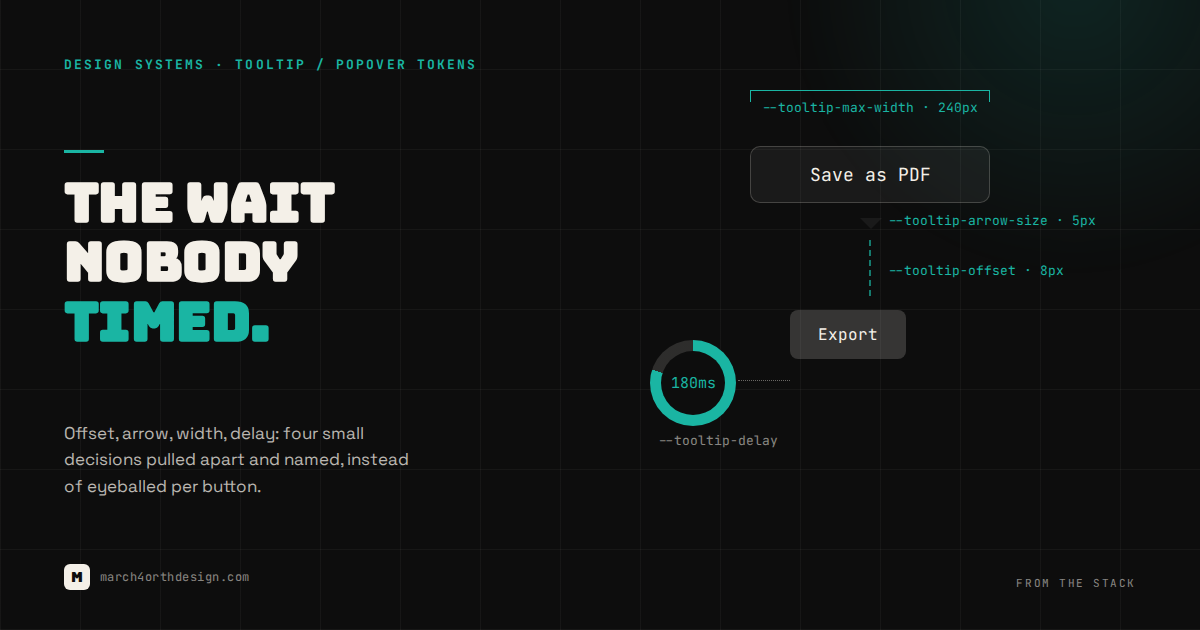

Every tooltip in your product decided, on its own, how long to wait, how far to float, and how wide it’s allowed to grow.
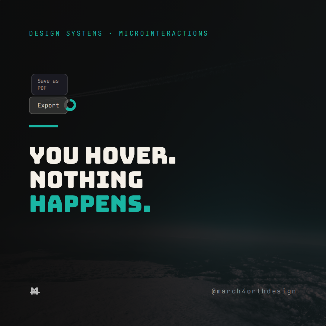
Tooltips get built the way toast notifications and avatar stacks do: fast, by whoever needed one first, copying whatever delay felt right at the time. One button pops its hint instantly on hover, because the designer who built it hates waiting. Another waits nearly half a second, because it was copied from a tutorial. A third has no max width at all, so a longer label wraps into four cramped lines instead of staying on two. None of this is a bug in any single component. It is four small decisions, each one reasonable in isolation, that were never written down anywhere a second developer could find them.

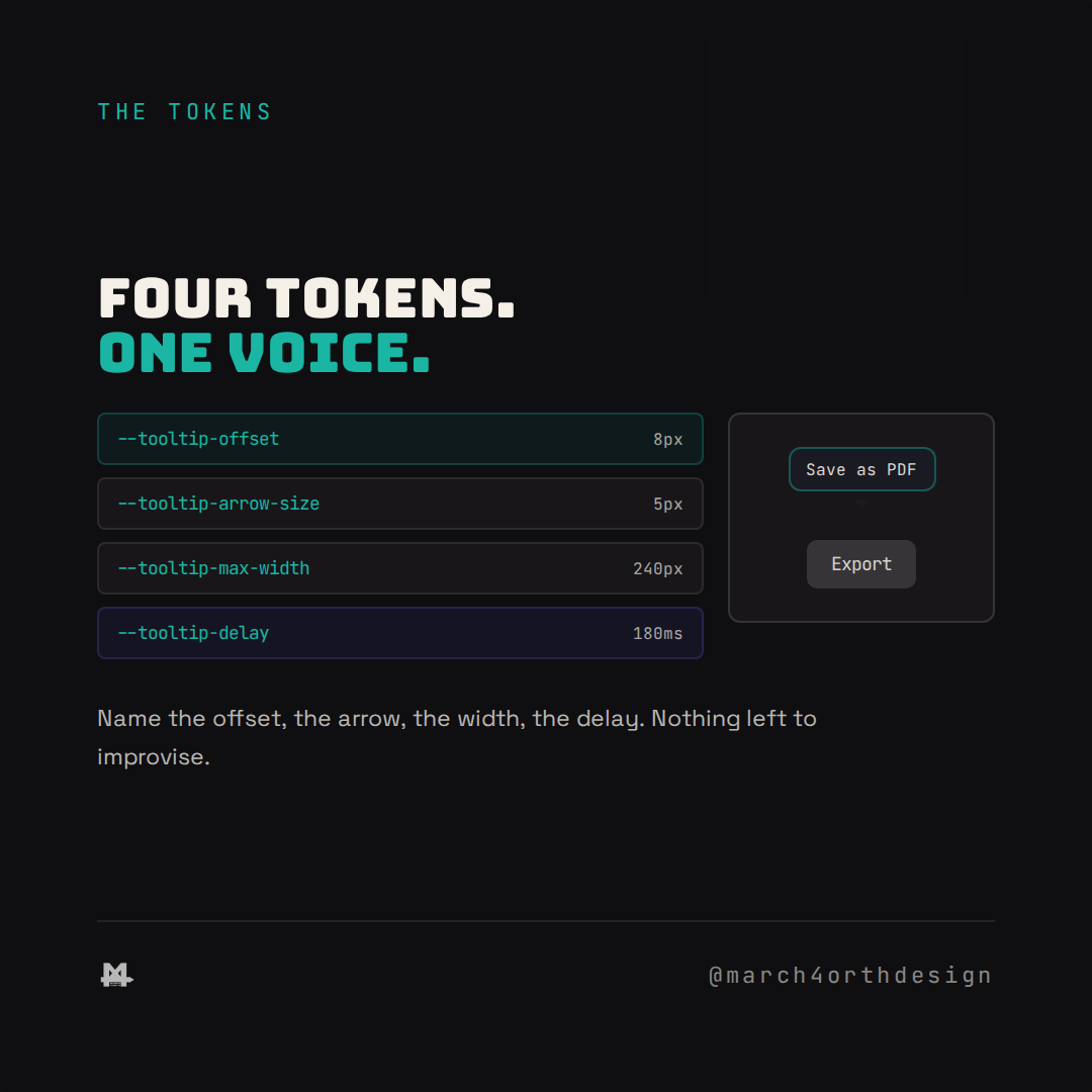
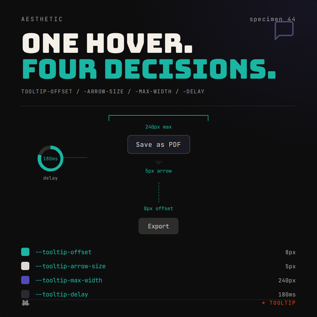
Four custom properties name the decision instead of leaving it to muscle memory. `--tooltip-delay` is the one value every hover waits against, so a sidebar icon and a settings toggle agree on how long a cursor has to linger before anything appears. `--tooltip-offset` fixes the gap between a tooltip and the element that triggered it, so some hints don't float awkwardly far while others crowd their trigger. `--tooltip-arrow-size` and `--tooltip-max-width` name the two decisions that shape how a tooltip actually reads: how big the pointing arrow gets, and how wide the pill is allowed to grow before wrapping. Neither of those is a color in the usual sense, which is exactly why they get improvised instead of named, right up until one tooltip's four-word label wraps worse than its neighbor's whole sentence.
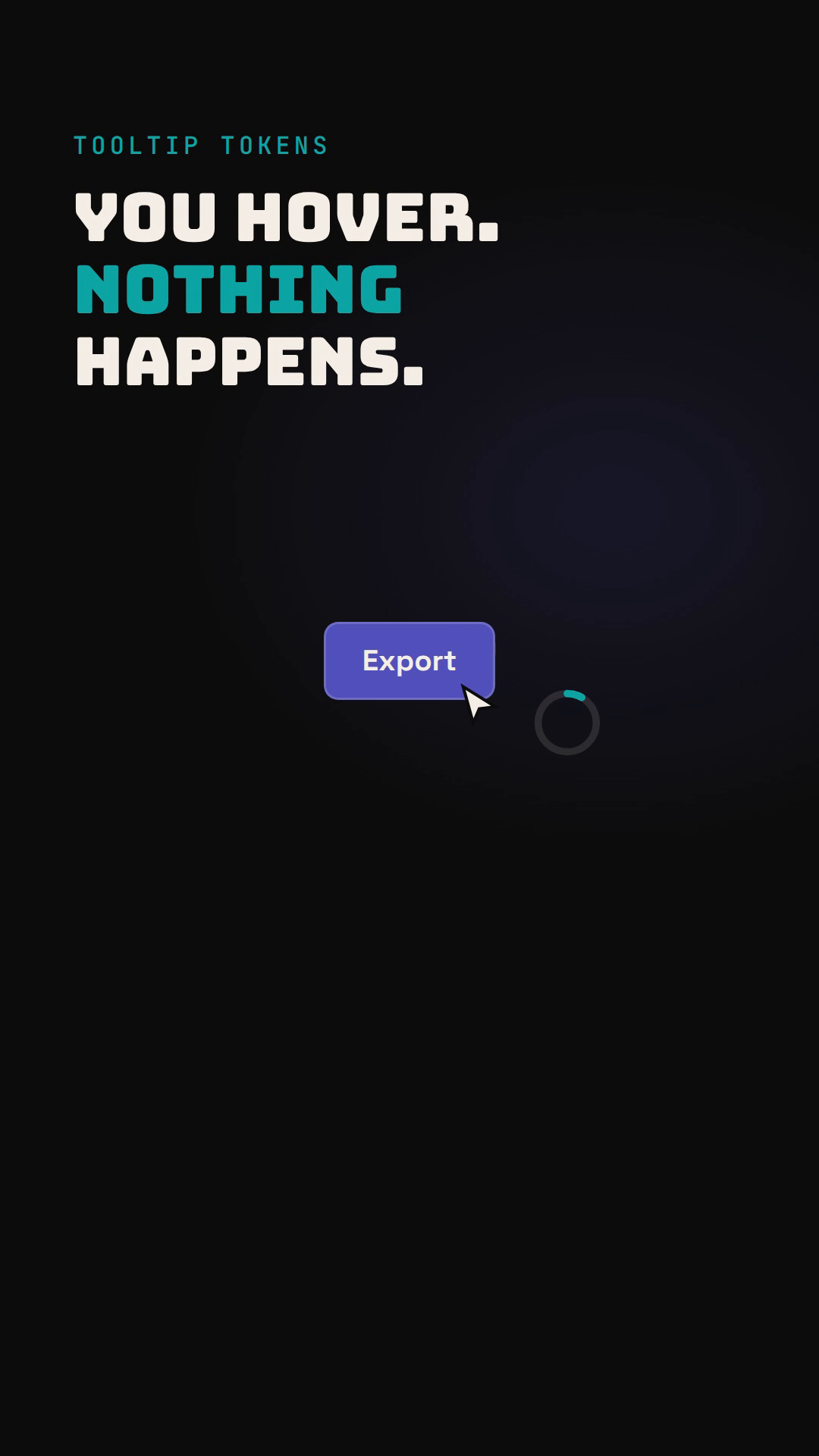
Watch the reel on Instagram. Link going live 2026-11-19 (Thu).
Applying the recipe is four variables read by one tooltip component, not a delay value eyeballed per button. Every trigger in the product, a toolbar icon, a form label, a disabled button explaining why it's disabled, points at the same offset, arrow, width, and delay, so the difference between components is the message, never the mechanics of how it shows up. A design system that only tokenizes what shows up in a style guide, color, type, spacing, misses the small interactive moments: the half-second a cursor sits still before the product says anything back.
Follow @march4orthdesign on Instagram for the next one.
Leave a Reply