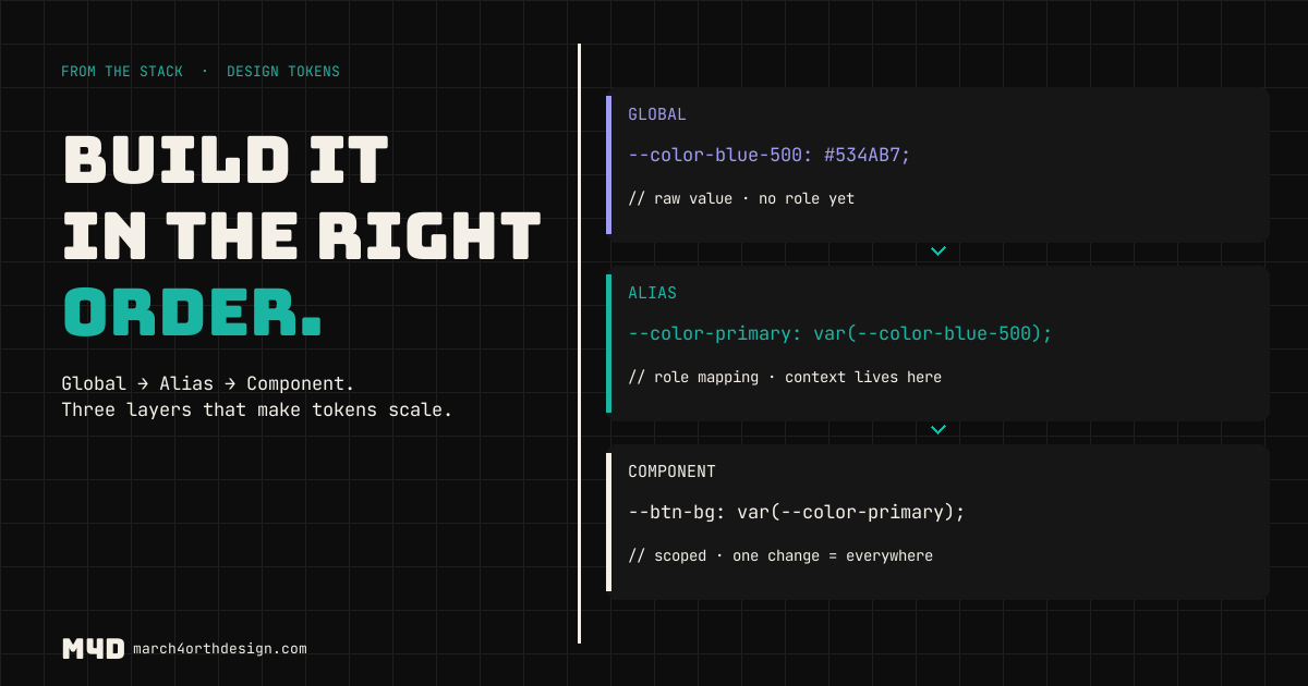
Category: Buttons
-
button state tokens: the three states nobody designs
—
by
in Accessibility, Buttons, Components, css, Educational, Sites, Styleguides, Tokens, UI KIt, UI/UX, WCAG, Web DesignA button has five real states, not two. Default and hover get designed; active, disabled, and loading get left to accident. Here’s how to name and token all five.
-
focus ring tokens: the accessibility feature people delete without meaning to
`outline: none;` is one line of CSS that quietly breaks keyboard navigation for every user tabbing through the page. Here’s how to token a real focus ring instead.
-
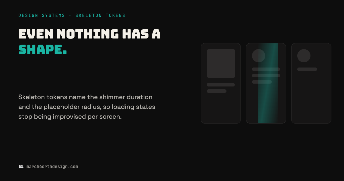
skeleton tokens: name the wait, not just the shape
—
by
in Accessibility, Buttons, Components, css, Educational, Sites, Styleguides, Tokens, UI KIt, UI/UX, WCAG, Web DesignThe four seconds before content arrives are not a mystery state. They are a design decision waiting for tokens. Most design systems cover the loaded state in detail and leave the loading state to whatever the frontend framework ships by default, usually a spinner with no clock and no shape. Skeleton tokens close that gap…
-
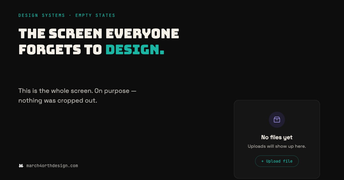
empty states: the screen everyone forgets to design
—
by
in Accessibility, Buttons, Components, css, Educational, Sites, Styleguides, Tokens, UI KIt, UI/UX, WCAG, Web DesignThe loaded state gets a spec. The empty one gets whatever someone types at 2am before launch. Every product has a moment where a screen has nothing in it yet: a new account with no files, a search with no results, a dashboard before the first data point lands. Teams spend real time on the…
-
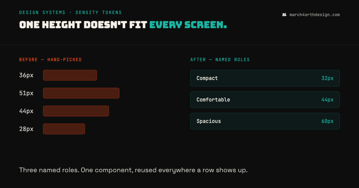
density tokens: the row height nobody agreed on
—
by
in Accessibility, Buttons, Components, css, Educational, Sites, Styleguides, Tokens, UI KIt, UI/UX, WCAG, Web DesignEvery screen ends up with its own row height, because nobody wrote down when to use which one. Dashboards, settings pages, and email templates all render the same kind of row, but each one usually gets a hand-picked pixel value: 36px here, 51px there, whatever looked right in the moment. Density tokens fix this by…
-
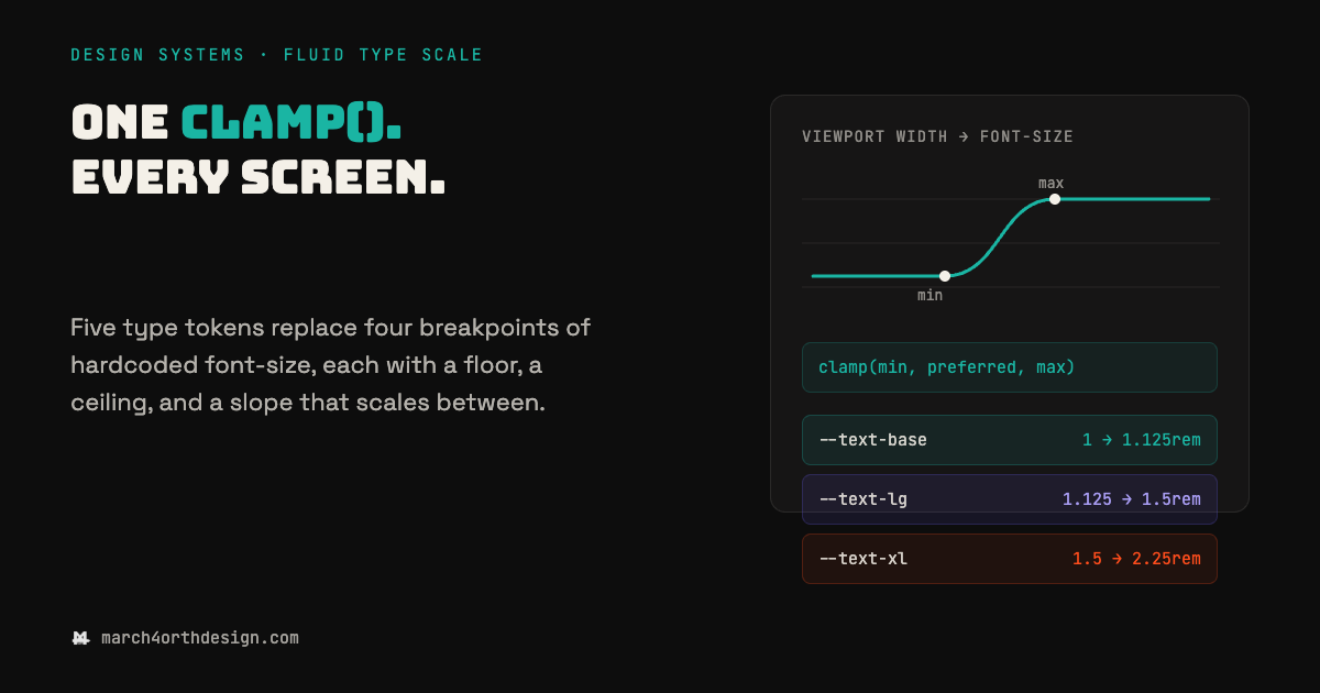
fluid type scale: the clamp() token that ends breakpoint math
—
by
in Accessibility, Buttons, Components, css, Educational, Sites, Styleguides, Tokens, UI KIt, UI/UX, WCAG, Web DesignA type scale hardcoded to four breakpoints is four separate guesses about how big text should be, not one decision. Most font-size tokens still live inside media queries: 28px on mobile, 34px at 640px, 40px at 768px, 48px at 1024px, each value picked by eye and none of them connected to the others. The gaps…
-
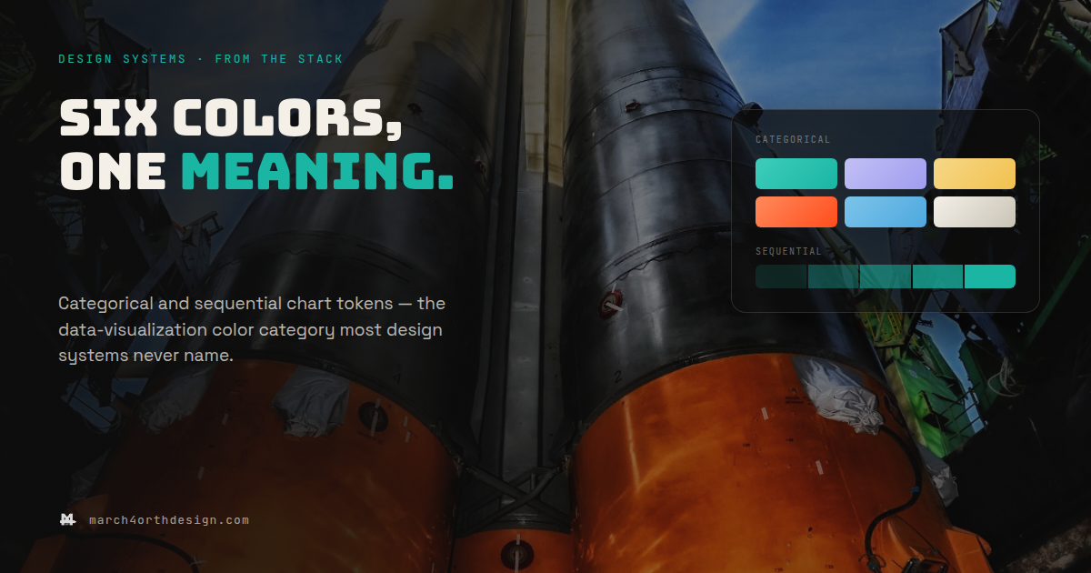
data visualization tokens: the chart color category most systems skip
—
by
in Accessibility, Buttons, Components, css, Educational, Sites, Styleguides, Tokens, UI KIt, UI/UX, WCAG, Web DesignSix chart colors, chosen by six different people, is not a palette – it’s six separate guesses that happen to render next to each other. Most design systems name every color except the ones inside a chart. Marketing’s dashboard uses orange for churn risk, support’s uses red, and nobody decided that on purpose – each…
-