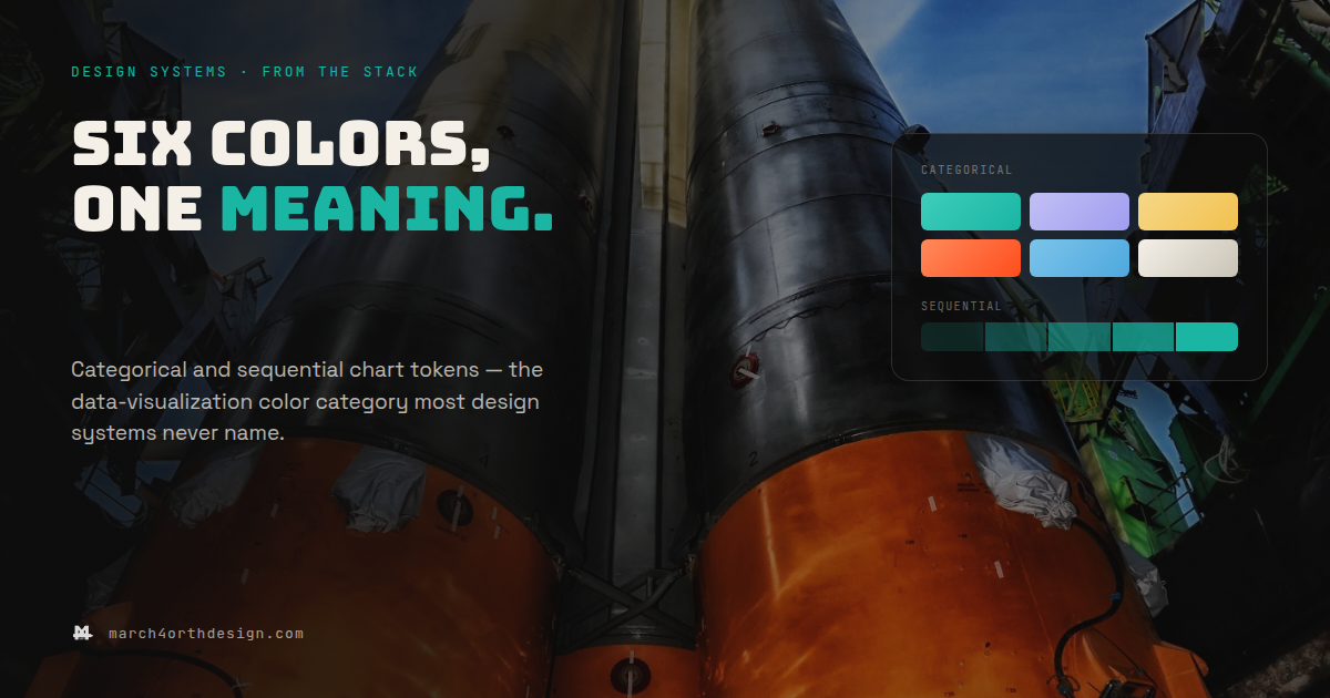

Six chart colors, chosen by six different people, is not a palette – it’s six separate guesses that happen to render next to each other.
Most design systems name every color except the ones inside a chart. Marketing's dashboard uses orange for churn risk, support's uses red, and nobody decided that on purpose - each team just picked whatever looked reasonable in the moment. Categorical tokens fix the "which color is this series" problem: a fixed, ordered set of hues assigned to roles like primary series or warning bucket, reused everywhere a chart needs to tell things apart. Sequential tokens solve a different problem - showing magnitude, like a heatmap or a progress fill - with a single hue stepped through five or so opacity stops instead of six unrelated colors standing in for a gradient. Once both sets exist as tokens, checked for contrast once instead of per chart, no team has to re-derive what orange means here from scratch.
Leave a Reply
You must be logged in to post a comment.