
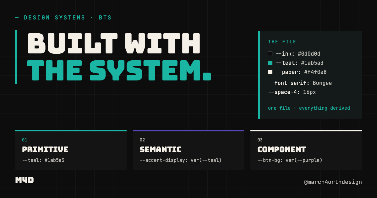
This site isn’t a demo of a design system. It runs on one — a single token file drives every color, spacing value, and type decision on the page you’re reading.
Most design systems content has a credibility problem. The system gets taught from mockups. The examples live in a sandbox. The person explaining tokens to you built their own site with one-off hex values and eyeballed padding, because shipping under a system is harder than presenting one. That gap is worth calling out, because it changes what you should trust: a system that has never carried real pages is a proposal, not a system.

So here is the test I put mine through: march4orthdesign.com is built from the same token file members download. Not a simplified version. Not a marketing skin. The same file.

The structure is three layers, and the layers are the whole trick.

**Primitives** are raw values with no opinion: `--ink: #0d0d0d`, `--paper: #f4f0e8`, `--teal: #1ab5a3`, `--purple: #534AB7`. Four color decisions. That's the entire palette — everything else on the site is one of these at a derived opacity. Secondary text is paper at 0.75. Body text floor is paper at 0.55, which clears WCAG AA at 5.64:1 on ink. Card fills are paper at 0.06. When contrast compliance is computed into the token values themselves, accessibility stops being an audit you run later and becomes a property the system can't lose.

**Semantic tokens** assign the intent: which value is the display accent, which one is reserved for CTAs, which opacity is the minimum a paragraph is allowed to use. This is the layer that stops drift. Nobody on this site ever writes a hex value into a page — they reference the decision, and the decision lives in one place.

**Component tokens** scope those decisions to UI: what a nav link uses, what a button background resolves to. When the accent color shifts someday, the buttons follow without anyone opening the files that contain them.

The same discipline covers everything that isn't color. Type is three fonts with three non-overlapping jobs — a display face for headlines, a grotesk for body and UI, a mono for labels and code. If a piece of text exists, exactly one of those three applies; there is no fourth font and no debate. Spacing is a base-8 scale, so every gap on the site is a multiple of a known step instead of a negotiation. Even the icons run on one spec: 20px, 1.5 stroke, no fill, one color. Boring on purpose — a spec you can hold in your head is a spec that actually gets followed.

Here's what changed once the site ran on the file. Building a new page stopped involving design decisions — the decisions were already made, so a new page is assembly, not invention. Consistency stopped requiring vigilance, because there's no way to introduce a rogue value without visibly stepping outside the system. And a redesign became a value change: edit the token, and every surface that references it updates.

That's the honest pitch for tokens. Not that they're elegant — that they compound. Every page you build under the system makes the next one cheaper.

If you want to start from a working file instead of a blank one, the M4D starter token file has the full primitive → semantic → component structure already wired — the same architecture this site runs on.
Leave a Reply
You must be logged in to post a comment.