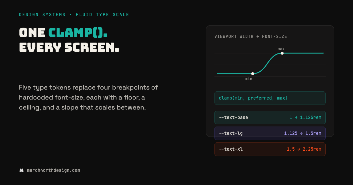

A type scale hardcoded to four breakpoints is four separate guesses about how big text should be, not one decision.
Most font-size tokens still live inside media queries: 28px on mobile, 34px at 640px, 40px at 768px, 48px at 1024px, each value picked by eye and none of them connected to the others. The gaps between those breakpoints get whatever size the last query set, so a screen at 700px renders the 640px value even though nothing about 700px matches it - the type just holds still until the next jump. clamp() replaces the whole stack with one declaration per role: a rem floor, a preferred value built from viewport width, and a rem ceiling. Below the floor viewport the size holds flat; above the ceiling it holds flat again; in between, the middle term scales continuously with the screen, so there's no jump to get wrong. Five roles, five clamp() values, and font-size never needs a media query again - the token does the interpolation a stack of manually tuned breakpoints was always approximating.
Leave a Reply
You must be logged in to post a comment.